PROJECT BRIEF
Redesign existing product packaging for a modern Asian home store. The company believes it's current sushi product kit isn't generating the volume of sales that it should. They wish to make the product more appealing to a new target audience. They want to design a new product logo and packaging solution. The existing company logo and the new product logo must appear on the new packaging. The packaging solution will be a single piece construction with a working EAN13 barcode
CHALLENGE
Creating a single dyeline to fit the sushi making kit package that uses a minimum of space. Designing and implementing a modern style that represents Asian culture.
SOLUTION
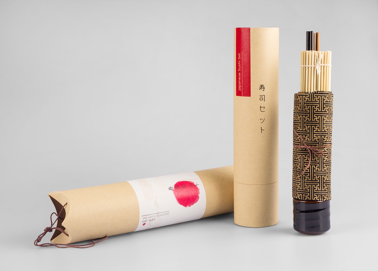
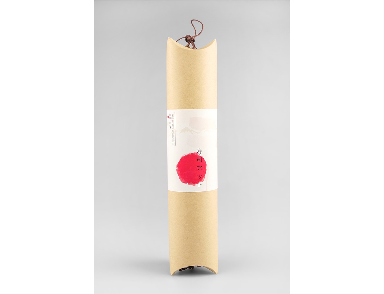
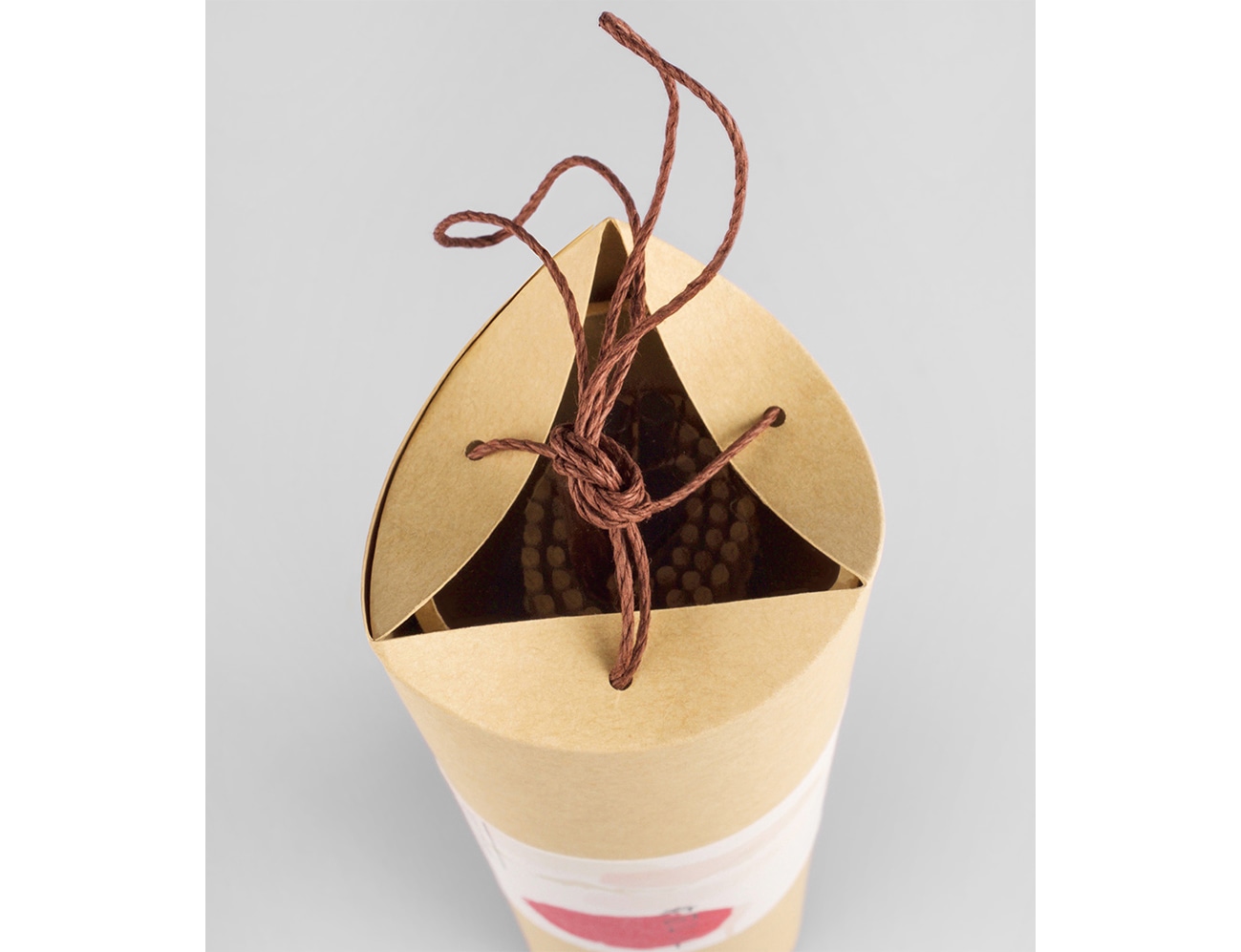
Final package was created from sustainable material to give an earthy flavour. The new product logo and typography represents Asian culture and style to give an original feeling. The traditional red and white colours of Japan were used, which represent happiness and joy. The outside label of the packaging shows what's included in the package. To further attract customers, the packaging has a see through top to reveal what is inside. The stripe on the top of the package gives a handmade touch. In store the product can stand on shelf to create an eye catching effect.
Also see this showcased for The Best Japanese Packaging Designs 2023 over at Design Rush