PROJECT BRIEF
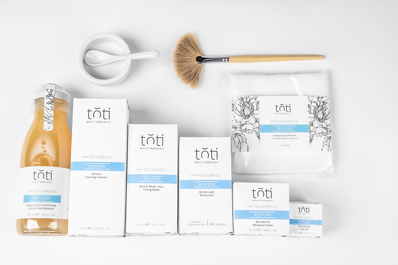
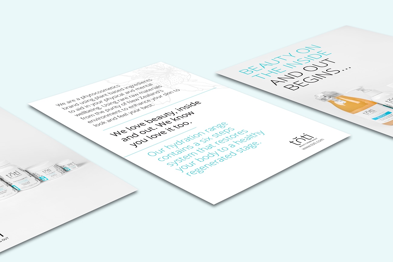
Develop and design a range of campaign items for a cosmetic company to promote its new Rehydra product range, which focuses on women with dry and dehydrated skin. The idea is every product range should use a colour which represents a type of skin. Produce product packaging, logo, promotional flyer and brochure to attract health conscience women who want professional and natural beauty products. Have to source and create all of the content and photograph products.
CHALLENGE
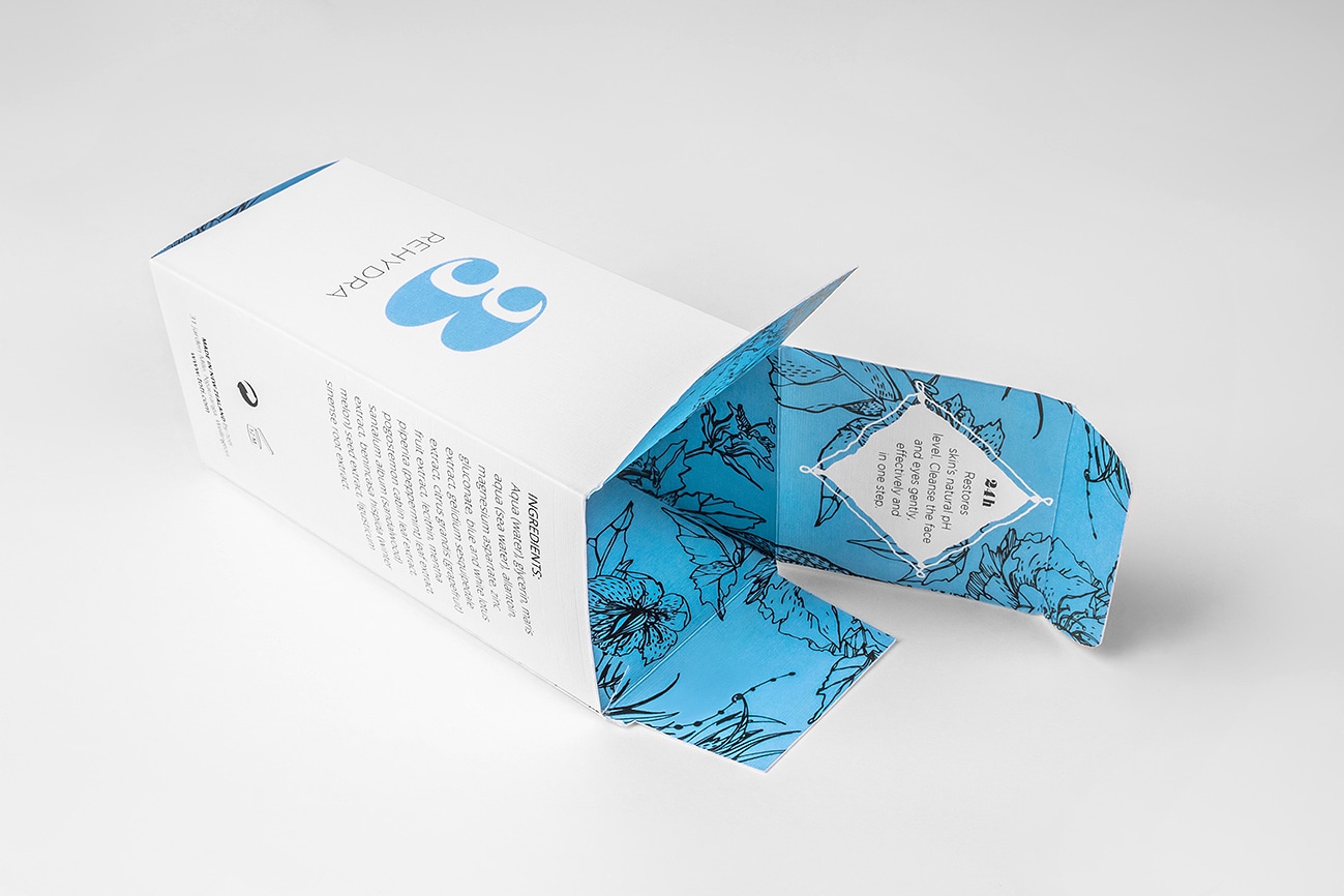
Develop and design a cosmetic range which attract the target audience. Creating dyelines for the packaging. Developing cosmetic content, container styles, and sizes for the range. Photograph product items, set up studio lights, create interesting imagery and edit photos
SOLUTION
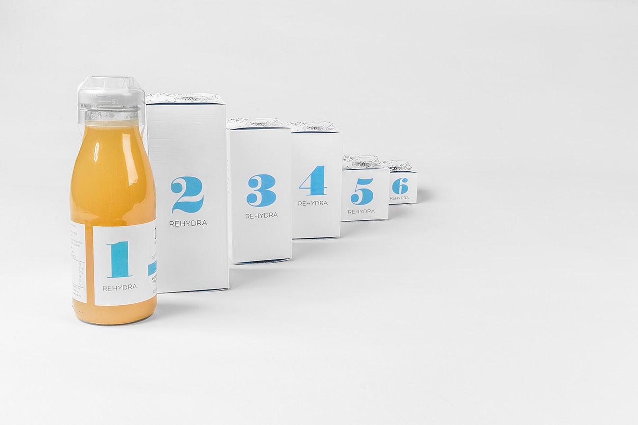
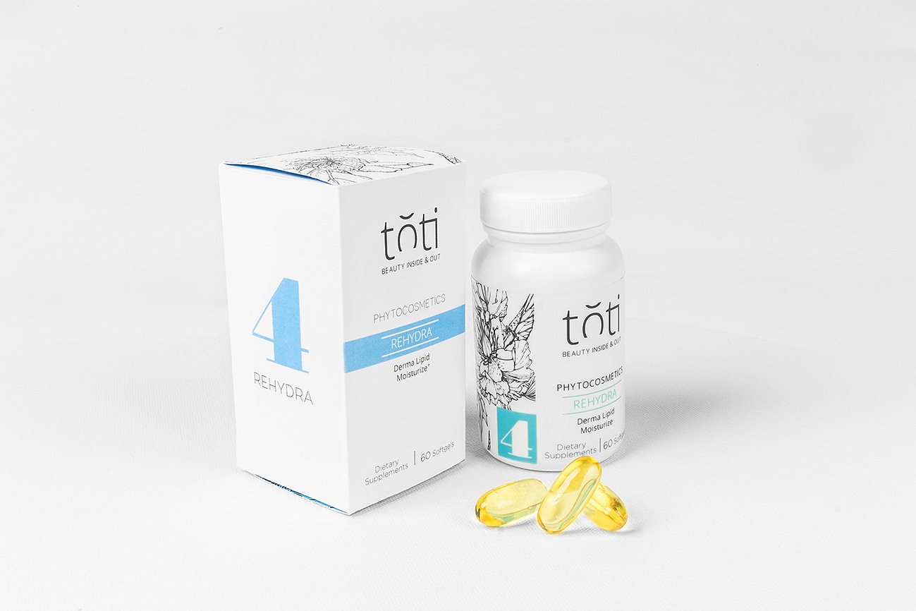
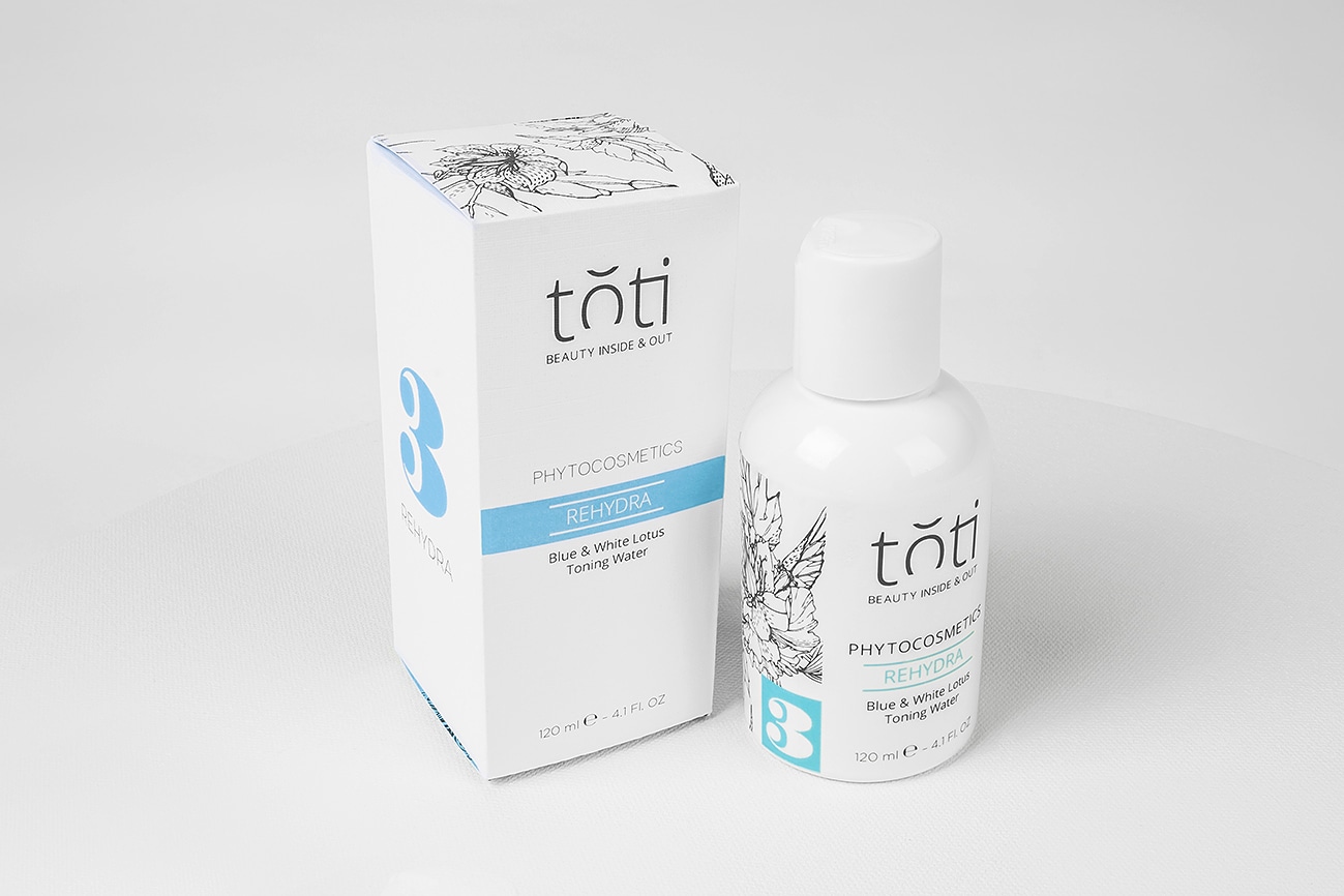
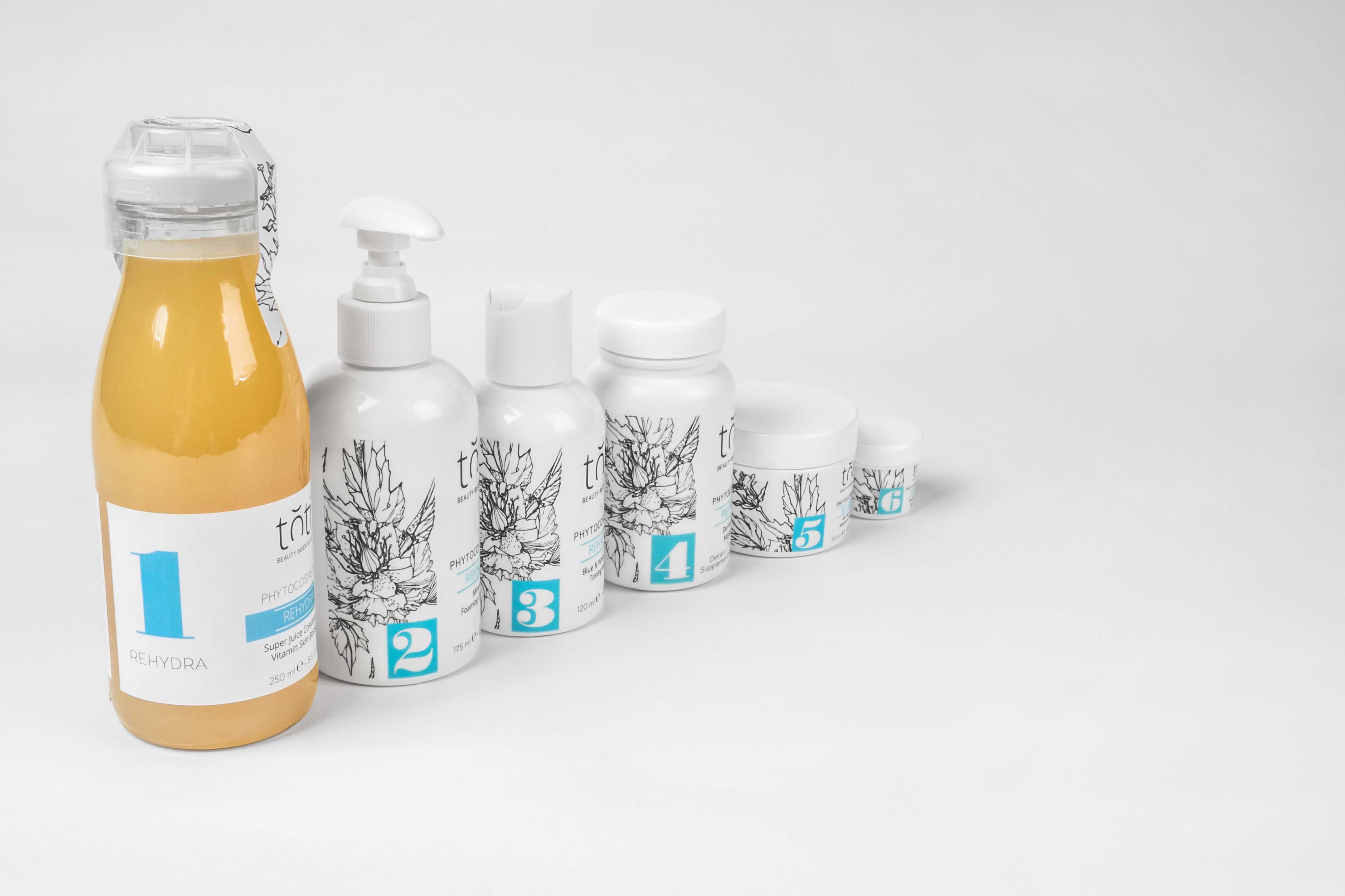
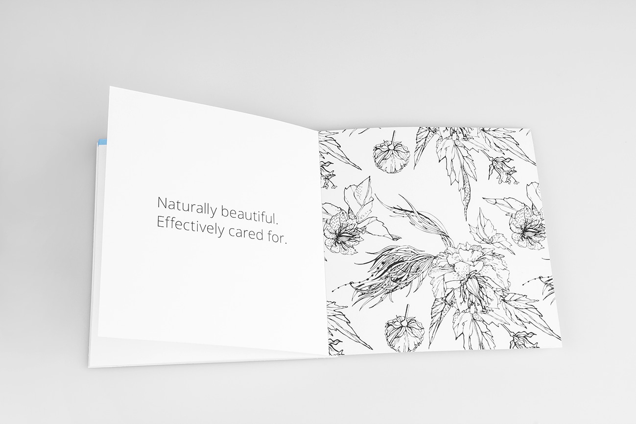
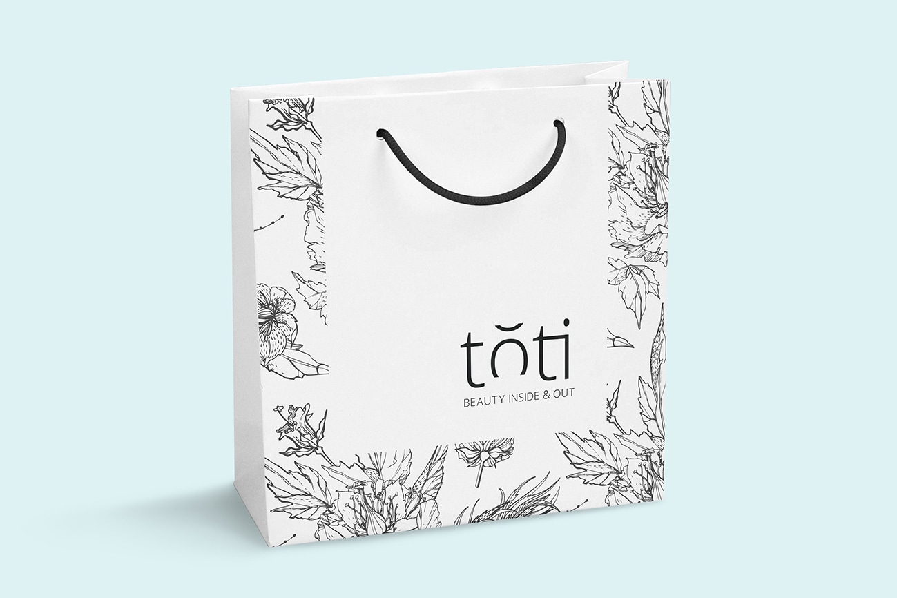
Developed and designed a simple and clean brand. The blue colour represents freshness, water and hydration. The logo is a simple typeface with an elegant touch. The letter 'O' represents harmony and balance. Plant illustrations were created to provide a natural look. Inside every package a message is provided to tell a story about each product. The promotional items provide information about the company philosophy and the Rehydra line to educate the audience and promote the product. Every package has a number for step by step usage.